 Tableau | Data visualisation | Tool strategy
 Tableau 10: Design for mobile devices (device specific designer)
Tableau 10 finally lets you design dashboards for phones, tablets and desktop in one workbook — but it's not responsive, and here's why that's actually fine.
- Tableau 10's device preview lets you add dedicated phone, tablet and desktop layouts from a single workbook instead of building separate dashboards switched via CSS and JavaScript
- The feature isn't responsive in the web sense — there are no breakpoints, you design each device layout explicitly, which Tim argues makes sense because visualisations lack the uniform rules buttons and paragraphs have
- Floating layout containers cause problems on mobile; layout containers fit far better because you need everything to sit logically on a scrollable canvas
- Device layouts share underlying elements, so editing one item (like switching a click action to touch, or repositioning a map) can unintentionally change it across other layouts
- Tableau auto-sizes content reasonably well with options like 'fit all' and 'fit width', but you'll often need to manually reposition elements and accept a messier process for narrow phone screens
Tableau 10 lets you design phone, tablet and desktop layouts inside a single workbook instead of building separate dashboards stitched together with CSS and JavaScript, but it's worth understanding it isn't truly responsive before you rely on it.
Tim reworks a marathon route dashboard he'd previously built as two separate mobile and tablet versions, using it to test Tableau 10's new device preview and layout options.
- Old way: separate dashboards, code-switched 0:00
Previously you'd build a distinct dashboard per device and use CSS/JavaScript to decide which one to show, faking a responsive feel rather than truly achieving it.
- Turn on device preview 1:05
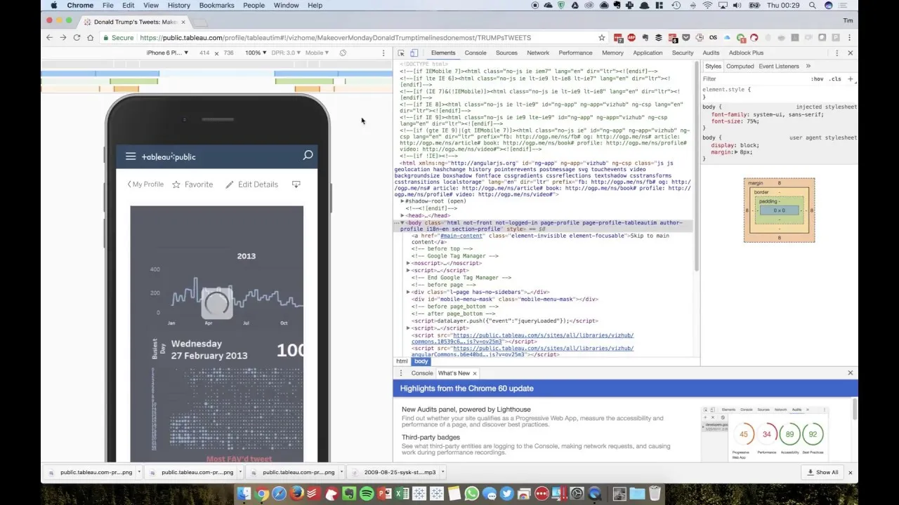
Device preview shows a border on your dashboard indicating where a given screen would cut content off, so you can see the problem before you fix it. From there you add a dedicated layout (phone, tablet, desktop) and Tableau's auto-size options like 'fit all' can do a reasonably good job on their own, especially for less cramped devices like tablets.
- Layout options are limited to broad device categories 2:22
You can create a layout for a generic phone or tablet class (e.g. iPad) but not for every individual device model, so very different screen resolutions within the same category still share one layout.
- Floating containers break down on mobile 2:42
If your original dashboard uses floating elements, they cause real problems once you shrink to a phone layout — switch elements to standard layout containers instead, since mobile design works best as a scrollable canvas where everything sits in logical order.
- Rebuild the phone layout manually 4:00
Starting from 'fit width', increase height to give yourself room, un-float elements one by one, and manually reposition and resize things like maps and floating logos. Expect this to be a somewhat messy, iterative process rather than a clean automated fit.
- Why there's no responsive breakpoint system 5:46
Responsive web design works because elements like buttons and paragraphs follow consistent, predictable rules; visualisations don't share that uniformity, so Tim argues it makes sense that Tableau requires you to design each device layout explicitly rather than trying to infer breakpoints.
- Shared elements can leak changes across layouts 7:24
Editing an item in one device layout — such as changing a click action to a touch action, or repositioning a map — can unintentionally alter that same element in your other layouts, since layouts share underlying objects. Be deliberate about which changes you make where, and expect to sometimes duplicate an item rather than edit a shared one.
- Custom positioning changes made while refining a phone map layout altered the same map's position in the tablet and default layouts too.
- Click-based interactivity doesn't suit touch devices well, but changing it in one layout changes it everywhere it's used.
- Device-specific layouts only cover broad categories (phone/tablet/desktop), not individual device resolutions.
- This was tested in a beta/early state, so some quirks may be expected behaviour rather than bugs.
Reach for this when you need a dashboard to work reasonably well across desktop, tablet and phone without maintaining three separate workbooks and custom code to switch between them — accepting that you'll still need to manually tailor each layout, especially for phones.
How this Rollup was made provenance & method
A Rollup is drafted by AI from the video's transcript, then reviewed and edited by Tim. Everything used to produce this one is listed below (the model, the exact prompt, and the source video), so the process is transparent and reproducible.
- Transcription
- On-device: NVIDIA Parakeet v3 for recent videos, OpenAI Whisper large-v3 for earlier ones. The transcript never leaves the machine or gets published.
- Drafting
- Claude Sonnet 5 in the cloud, from that transcript.
- Prompt
- The exact Rollup prompt (v2) , the full system prompt, unedited.
- Mode
- Walkthrough: a timestamped breakdown in video order, for a demo or how-to. Written before modes existed, when every Rollup was a walkthrough.
- Source video
- Watch on YouTube
- Drafted
- 5 July 2026 at 09:38
- Reviewed & edited
- 5 July 2026 at 09:41 · by Tim Ngwena
Model + prompt + video is everything you'd need to recreate a Rollup like this yourself. The one thing we don't share is the transcript.
Rights. The video and its transcript are the property of TN Media Ltd. Unauthorised use or download is prohibited. © TN Media Ltd.